Jo Bygg
identity
Website: Jobygg.no
Category: Identity, Construction
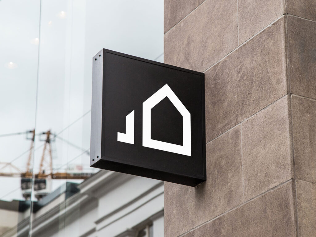
Jo Bygg is a construction company deeply rooted in place—its identity shaped by the surrounding mountains, traditional shelters, and the quiet strength of local heritage. With its main office based on the family farm in Nedreberg, the brand needed to reflect its origins while also standing tall in a modern market.
I developed a visual identity that’s intentionally understated but impactful—built around a few carefully crafted elements that highlight the people, the craftsmanship, and the landscape that defines Jo Bygg. It was important that the brand felt natural in its environment—aligned with the land and local culture—yet bold enough to make an impression across vehicles, signage, and marketing materials.
This was all about balance: timeless roots, modern presence.